When we launched “Fantastic Defenders,” the first volume of our new Worlds Enough anthology series, we were never quite as happy with the cover as we’d hoped. The issue wasn’t with the cover art, which we thought was both excellent and well worth the money we’d paid (that’s how you get real cover art by the way…you buy it from somebody good). But the typography…the design…of the cover wasn’t quite as snazzy as we’d hoped. Additionally, the cover was perhaps just a little bit dark. Some of the key details simply didn’t stand out when the cover was shown as a thumbnail.
The thing about indie publishing is, if you’re doing it right, your book is available forever. We always knew we were going to do something down the road to improve the cover. It wasn’t horrible, it just needed some tuning.
Well, that time is now.
Maybe we should have done something sooner. In fact, yes, absolutely, we should have. But with indie publishing, there’s never a shortage of work to be done. There’s always another deadline, more words to write, another convention to prepare for, etc.
When I took on the task of tuning up the cover, I consulting with Don Anderson, a graphic artist. We discussed the flaws of the original cover:
- Uninspired typography.
- Unclear delineation of Worlds Enough as the series name, not the volume name.
- Rough snow on the bottom of the page distracted from the names of the editors.
- Despite the snow, the cover was just a little too dark.
- Key details, especially the sword, not visible in thumbnail.
- Remove the list of writers on the right side of the cover.
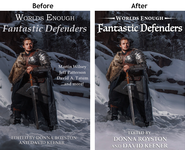
Above, you can see the Before and After versions of the cover.
One key addition was little graphic chevrons on either side of the series title. They’re small, but they subtly serve to set “Worlds Enough” off as the series title and, by contrast, emphasize “Fantastic Defenders as the title of the anthology. Although not shown, slightly stubbier chevrons are used as the bullets on the back cover blurb. So the chevrons are functioning as a unifying element of an overall theme.
The overall cover has been lightened, so some of the fine details are more visible. The sword has been lightened even more in order to make that feature more prominent (and visible in a thumbnail).
The snow at the bottom of the page has been lightened and smoothed, and the editorial designation has a drop shadow. Combined, this makes the names of the editors easier to read.
Overall, I feel like the cover has been improved. The changes might not be dramatic, but even a 10% improvement (however you might quantify that) seems like a worthwhile endeavor.
Leave a Reply